All biological pathways in a cell are linked together and can interact with each other in unpredictable ways. When putting a pathway down on paper it’s sometimes hard to decide where exactly one pathway ends and the other begins. As such, borders between Pathways are nearly always completely arbitrary. My supervisor always says (jokingly) that a good rule of thumb is that a pathway should include only that which can fit on a single screen (and as monitor resolutions have increased in the past, so has the average pathway size).
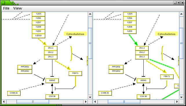
I ran into the problem of pathway size when testing my Pathway Diff viewer. When you do a Diff you want to see the old and new version side by side, but that takes too much screen space. The solution I came up with is to view them in two panels with scrollbars, as in the screenshot below:
The two panels scroll together and you can zoom them in and out together as well.
As this is all done in Java, it’s not much work to turn this into a little applet so you can view the pathway online, using good old-fashioned Web 1.0 technology.
All this has the additional advantage that by letting the applet render the image instead of relying on SVG, I don’t have to let the browser render the SVG. SVG rendering in firefox has turned out to be quite buggy.
Tags: applets, diffviewer, gsoc

Please report the Firefox SVG bugs.
Also try other SVG viewers for comparison. Opera is quite nice.
Most of the time I use Inkscape for viewing SVG, it’s quite nice.
And you’re right, I should report that bug. Will do (if it’s not already know yet)